基本 
インポート
import numpy as np
import matplotlib.pyplot as plt
プロット
matplotlibはFigureクラスとAxesクラスのインスタンスを使って描画する。図全体がFigureでグラフがAxesになる。matplotlib.pyplotクラスのメソッドはコマンドのように扱える。オブジェクト指向的な書き方をしない場合はアクティブになっているオブジェクトに対して作用する。
- オブジェクト指向的な書き方
fig = plt.figure()          #Figureオブジェクトを作成。
ax = fig.add_subplot(111)   #AxesSubplotオブジェクトの作成(プロットする領域)。
ax.plot([1,2,3])            #axにプロット
fig.show()                  #表示
- 対話的な書き方
plt.figure(1)     #省略可
plt.subplot(111)  #省略可
plt.plot([1,2,3]) #アクティブなfigureとaxesに作用する。
plt.show()
図を閉じる
plt.close()        #カレントのfigureを閉じる
plt.close('all')   #全てのfigureを閉じる
スクリプトで連続して複数の図を描くときは、メモリ消費を減らすため不要になったらclose()するようにする。アクティブなオブジェクトの取得
対話モードなどでアクティブになっているfigureやaxesを取得できる。
#figure
fig = plt.gcf()
#axes
ax = plt.gca()
カレントaxisを変更する。
plt.sca(ax)
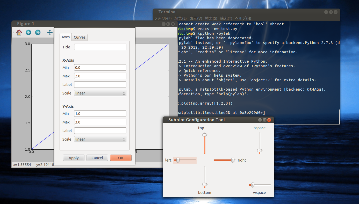
GUIでの操作
plt.show()で図を表示すると操作ボタンのついたウィンドウが現れる。アイコンボタンをクリックするとズームや余白、タイトル、ラベル、色などの調整ウィンドウが現れるので図を見ながら調整できる。
インタラクティブモード
ipythonや端末上で使う場合は図を見ながらできるインタラクティブモードが便利である。
plt.ion()でインタラクティブモードに移行するか、ipythonの場合は
$ ipython -pylabで起動すればよい。
図の大きさ・配置・色
キャンバスのサイズ・解像度を設定する。
plt.figure(figsize=(横, 縦), dpi=解像度, facecolor=背景色)キャンバス(ウィンドウ)の大きさはインチ単位。デフォルトはfigsize=(8, 6)、dpi=80
図の余白
subplots_adjustを使いaxisオブジェクトの値を変更する。GUIであとからでも調整可能だが図が複数あると上手く行かない。
現在の余白情報を取得するには、
今後プロットする全てのfigureで有効にしたい場合は、デフォルト値を変更する。
plt.subplots_adjust(left=0.1, right=0.9)
| left/right/top/bottom | subplotの左/右/下/上の位置 |
|---|---|
| wspace/hspace | subplotどうしの左右/上下の余白 |
top = fig.subplotpars.top
wspace = fig.subplotpars.wspace
で取得できる。
今後プロットする全てのfigureで有効にしたい場合は、デフォルト値を変更する。
import matplotlib as mpl
mpl.rc('figure.subplot',left=0.08,hspace=0.05,wspace=0,bottom=0.05,top=0.92)
元に戻すには、mpl.rcdefaults()としてデフォルト値を再読み込みする。
背景を透明にする。
パワポとかで色つき背景を使うときに図の背景が透明だと見栄えがいい。図として保存すするときは、
plt.savefig('hoge.png', transparent=True)
で透明にできる。ただしこれだとキャンパスだけでなくて図の未定義値とかの部分まで透明になるので、Axesオブジェクト以外のFigureを透明にするときは、fig = plt.figure() fig.patch.set_alpha(0.)
色の巡回パターンを指定する。
plotやcontourの色は何も指定しなければ、青-緑-赤-シアン-マゼンダ-黄色-黒、の順で巡回する。巡回パターンは、axes.color_cycleというパラメータで指定する。設定ファイル~/.matplotlib/matplotlibrc(ver1.3からデフォルトは~/.config/matplotlib/matplotlibrcになる)に記述しておけば、デフォルトの巡回パターンを指定できる。
また、色の状態は、axesオブジェクトごとに保持されており、ax._get_lines.color_cycleというイテレータが管理している。
また、色の状態は、axesオブジェクトごとに保持されており、ax._get_lines.color_cycleというイテレータが管理している。
マルチプロット
複数の図を1枚の画面にかくことができる。体裁を求めなければsubplotとsubplot_adjustで十分。AxesGrid toolkitを使う方法もある。
複数の図を描く
実際に図が描かれるのはfigureオブジェクトではなくてその上に配置されるAxesオブジェクト。subplotで作成する。
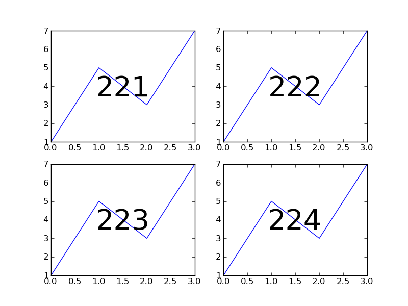
plt.subplot(2,2,1)
#または
plt.subplot(221)
のように数字を3つ並べることでAxesオブジェクトを複数配置できる。3つの数字は縦の分割数、横の分割数、順序である。221だと縦横2分割したときの1番目に図が配置される。順序は行-列の順で決まる。10個以上書きたい時はカンマで区切らないとだめ。
- 例 2×2分割したときの221,222,223,224が示す場所
サイズの違う図を並べる

AxesGrid toolkit
AxesGrid toolkitはマルチプロットのためのツールを提供するクラス。複雑な図がかける。
マルチプロットをタイル状に配置する
軸を共有したりラベルを一部につけるなどが簡単にできる。ただし個々の図にタイトルが書けないなど不便な点もある。
from mpl_toolkits.axes_grid1 import ImageGrid

fig = plt.figure()
grid = ImageGrid(fig, 111,                 #figureとsubplotの引数でマルチプロットする枠を指定
                     nrows_ncols = (1, 3),   #(行, 列)で分割数を指定
                     )

for i in range(3):                                #ImageGridはaxesのリストみたいになっているので個々の要素にプロットしていく。
    ax = grid[i]
    ax.imshow(Z[i])
- オプション
| direction | 図をどの順にリストに配置するか。行方向優先('row')と列方向優先('column')を指定可能。デフォルトはrowでsubplotと同じ。 |
|---|---|
| axes_pad | 図の間隔(インチ)。デフォルトは0.05 |
| add_all | |
| label_mode | 軸目盛のラベルをどこにつけるか。すべての図('all')、左端と下端('L')、左下の図のみ('1') |
| share_all | x軸とy軸をすべて共有するか |
| cbar_location | カラーバーの位置 |
| cbar_mode | それぞれの図のカラーバーを描くか。1つのカラーバーで代用('single')、それぞれの図に描く('each') |
| cbar_size | |
| cbar_pad |
凡例
凡例を表示
ax.plot(x,y,label="label1")
ax.legend(shadow=True, loc=場所番号)  #影つき
オプション
デフォルト値はmatplotlibの設定ファイルでlegend.keywordの形で指定できる。
- 凡例の位置(loc)
| best | 0 | upper right | 1 | upper left | 2 | lower left | 3 | lower right | 4 | right | 5 |
|---|---|---|---|---|---|---|---|---|---|---|---|
| center left | 6 | center right | 7 | lower center | 8 | upper center | 9 | center | 10 |
ax.legend(loc=1)
ax.legend(loc='upper right')
- 凡例の装飾についての設定
| shadow | 枠に影をつける |
|---|---|
| fancybox | 枠の角を丸くする |
| frameon | 枠を描く |
| title | 凡例につけるタイトル文字列 |
- 表示方法についての設定
| ncol | 凡例の列数 |
|---|
- マーカーやラインについての設定
| numpoints | lineプロットの際のマーカーの数。デフォルトは2 |
|---|---|
| scatterpoints | scatterプロットの際のマーカーの数。 |
| markerscale | 凡例の表示するマーカーの大きさ。実際の図のマーカーに対する相対的な大きさで指定 |
| handlelength | lineの長さ |
| handlelheight | lineの高さ |
- 余白についての設定
| handletextpad | 凡例の記号とラベルテキストとの余白 |
|---|---|
| borderaxespad | |
| borderpad | |
| columnspacing | 凡例が複数列の場合の間の余白 |
| labelspacing | ラベル間の上下の余白 |
凡例の位置を自由に決める
bbox_to_anchorオプションを使う。軸領域の左下を(0, 0)、右上を(1, 1)としたときの座標でアンカーを指定する。locを指定するとそのアンカーに対する凡例の位置が決定される。
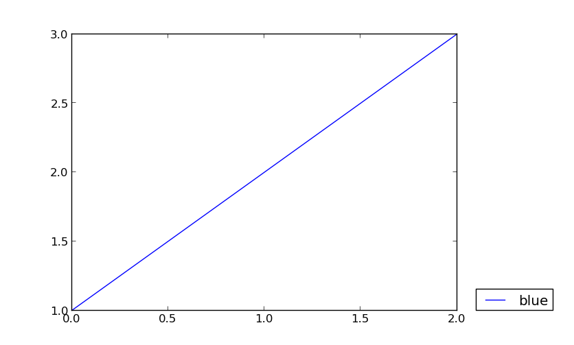
ax.legend(bbox_to_anchor=(1.05, 0), loc='bottom left', borderaxespad=0) #凡例の左下が(1.05, 0)になるように凡例の領域(axes)と実際に描画される枠線との間には一定の余白をとるようになっているのでborderaxespadをゼロにしないとbbox_to_anchorの座標ぴったりにはならない。
- 位置に関するオプション
| bbox_to_anchor | (x, y)または(x, y, 幅, 高さ)のタプルで指定。大きさは図の軸領域の縦、横を1としたときの大きさ、座標になる。 |
|---|---|
| bbox_transform | transAxesオブジェクトを与えることでbbox_to_anchorの基準座標、長さを変える |
| borderaxespad | 凡例の領域境界と枠線との間の余白 |
凡例のフォントサイズを変える
propオプションに指定する。フォントの種類も指定可能。
#10ptにする場合
plt.legend(shadow=True, prop={'size' : 10})
凡例の表示順序を逆にする。
何も指定せずにplt.legend()をするとプロットした順に凡例が表示される。legend()の引数にはartistオブジェクトとラベルが渡されるのでこのリストを逆順にすればよい。
ax=plt.gca()
handles, labels = ax.get_legend_handles_labels()
plt.legend(handles[::-1], labels[::-1])
判例を複数列にしたときの順序を行優先にする
テキスト
図/x軸/y軸のタイトル
fig = plt.figure()
fig.suptitle("suptitle", fontweight="bold")

ax = fig.add_subplot(111)
ax.set_title("set_title")
ax.set_xlabel("set_xlabel")
ax.set_ylabel("set_ylabel")
#または
plt.title("title")
plt.xlabel("xlabel")
plt.ylabel("ylabel")
文字
#座標系での位置で指定
plt.text(0.2,0.5,"text")
plt.text(0.5,0.2,"text", fontsize=15, colot="red")

#相対座標で指定する場合。図の枠の左下が(0,0)、右上が(1,1)になる。
plt.text(0.01, 1.01, "text", transform=ax.transAxes)
- オプション
| horizontalalignment/ha | 文字のどの位置を水平方向の基準にするか。‘center’、‘right’、‘left’がある。 |
|---|---|
| verticalalignment/va | 鉛直方向の基準位置。'center'、'upper'、'bottom'、'baseline' |

追記 (2013.6.11)
textよりもannotateを使うほうがいい。
ax.annotate('Test', xy=(1, 0), xycoords='axes fraction', fontsize=16,
                         horizontalalignment='right', verticalalignment='bottom')
この場合は、xycoordsで指定した基準座標で、xyの位置にテキストが描画される。もっと、細かい設定も可能である。参考
 ax.annotate('Test', xy=(1, 0), xycoords='axes fraction', fontsize=16,
                           xytext=(-5, 5), textcoords='offset points',
                           ha='right', va='bottom')
textcoords='offset points'を指定すると、xycoordsで指定した基準座標で、xyの位置にまず基準点を置いて、そこを (0,0)としたとき、xytextの位置にテキストが描画される。- オプション
| xy | 位置。座標で指定。 |
|---|
- xycoords, textcoords
| figure points | |
|---|---|
| figure pixels | |
| figure fraction | |
| axes points’ | |
| axes pixels | |
| axes fraction | axesを基準にして、(0,0)が左下、(1,1)が右上 |
| data | |
| offset points | xyで指定した位置を基準にした、相対的な座標をピクセル単位で指定 |
| polar |
数式
LaTex形式で数式を記述できる。エスケープ文字として認識されてしまうのでrow文字列を使う。タイトルやラベルにももちろん使える。
plt.text(r'\frac{5}{2}') #5/2
数式フォントの設定
数式にはテキストフォントとは別設定のフォントが使われる。デフォルトを統一したかったので以下のように~/.matplotlib/matplotlibrcにかいた。
mathtext.fontset : stixsans                  #フォントfamilyをテキストのデフォルトと同じsans-selifにする。
mathtext.default : rm                             #数式フォントを\mathtextrm{}にする。デフォルトはイタリック
色
matplotlib.cmクラスは連続的な色をもつ。オプションキーワードとして指定できるプロットがある。
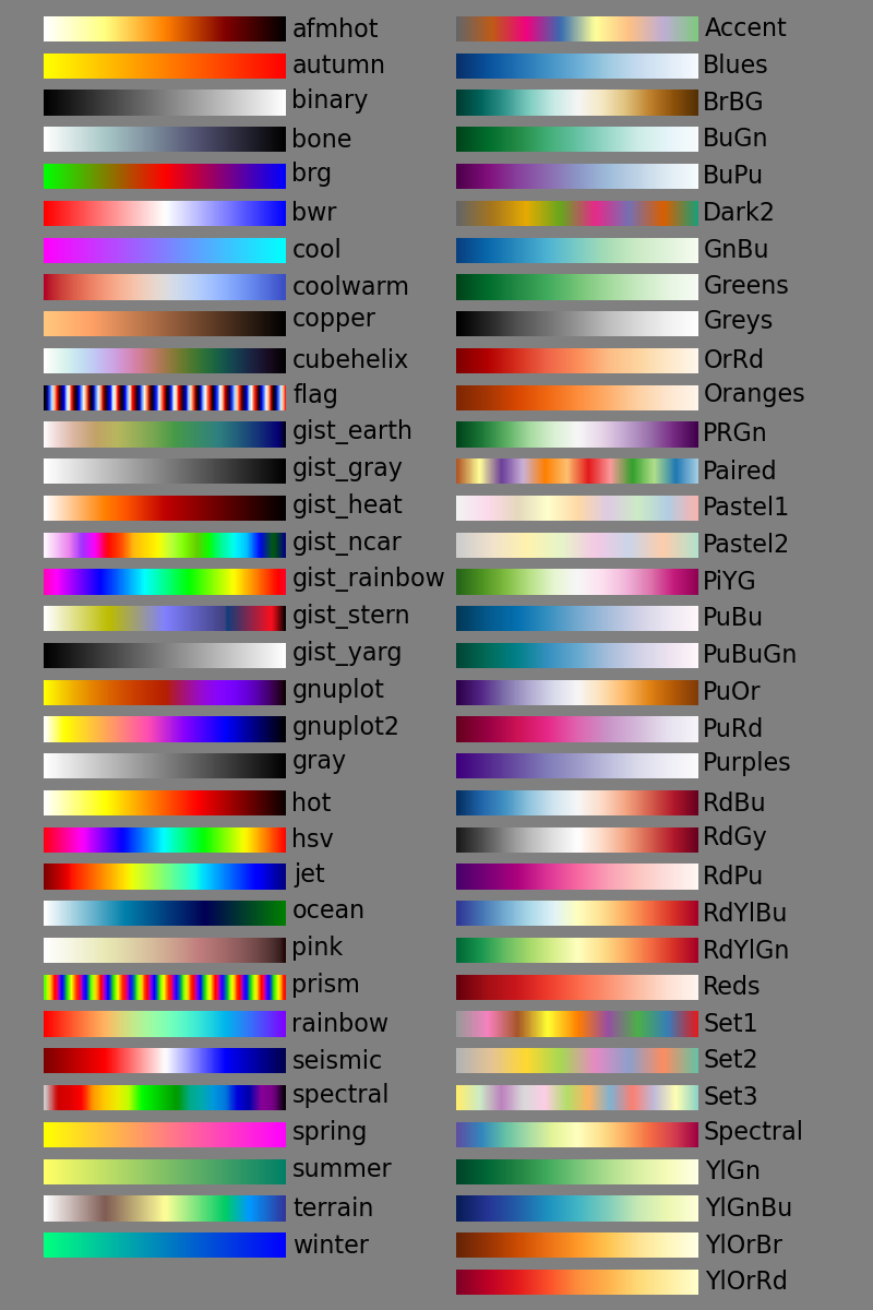
import matplotlib.cm as cm
plt.imshow(Z, cmap=cm.gist_rainbow)
ver.1.1.0ではデフォルトで以下のカラーマップがある。もちろん自分でつくることもできる。
- 標準で用意されているカラーマップには色変化を逆にしたものが用意されており、後ろに'_rをつける(例えばBrBGは茶→緑だがBrBG_rは緑→茶になる)。
色を連続的に変化させる。
用意されているカラーマップから範囲を指定してカラーマップをつくる
matplotlib.cmにあるカラーマップは関数みたいになっていて値を渡すと色の情報のリストを作ってくれる。これを利用して例えばscatterのcolorオプションなどに渡すカラーマップを調整することができる。カラーマップの両端が0と1になるので例えば0から7まで1ずつ変化するcm.jetカラーマップを作りたければ、
例えばscatterのcオプションにはカラーマップのリスト(RPG値のリスト?)を渡せばグラデーションで散布図がかける。contourやcontourfでも、colorsキーワードにリストを渡すことでレベルの色を指定できる。
colors = cm.jet(np.arange(0,7.1,1))
例えばscatterのcオプションにはカラーマップのリスト(RPG値のリスト?)を渡せばグラデーションで散布図がかける。contourやcontourfでも、colorsキーワードにリストを渡すことでレベルの色を指定できる。
plt.contourf(X, Y, Z, interval, colors=colors)
線を引く
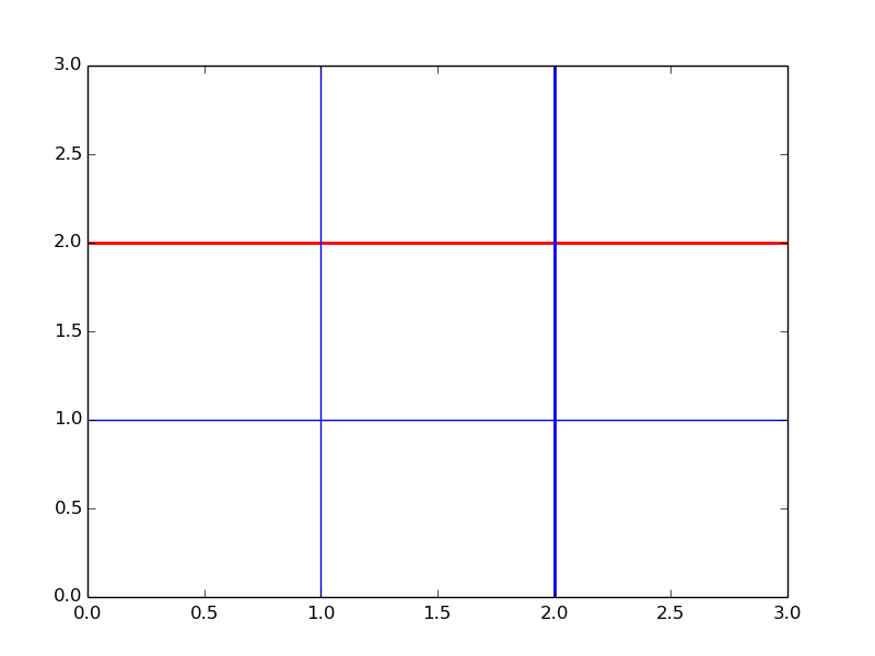
軸に平行な線を引く
plt.axhline(y=1)     # y=1に沿ってx軸平行に引く
plt.axvline(x=1)     # x=1に沿ってx軸垂直に引く
plt.axhline(y=2, lw=2, color='red')   #色や太さ、線種も設定できる
plt.axvline(x=2, lw=2, color='blue')
軸の設定
x,y軸の範囲を指定する
plt.axis([xmin,xmax,ymin,ymax])   #x,y軸の範囲を指定
plt.xlim([xmin,xmax])             #x軸の範囲
plt.ylim([ymin,ymax])             #y軸の範囲
キーワードで指定することもできる。
| off | 軸とラベルをオフにする。 |
|---|---|
| equal | x軸とy軸の1目盛りの図における長さが等しくなるように範囲を決める。 |
| scaled | |
| tight | データ長と同じにする。 |
plt.axis('tight')
軸の向きを逆にする。
axisオブジェクトに対して行う。
ax = plt.gca()
ax.invert_xaxis()
ax.invert_yaxis()
目盛りの表示のon/offを切り替える。
plt.majorticks_on/off()   # 主目盛りを表示する/しない
plt.minorticks_on/off()   # 補助目盛りを表示する/しない
軸目盛を指定する。
plt.xticks( arange(6) )
plt.yticks( arange(6) )
軸目盛の振り方を指定する。
軸メモリはmatplotlib.tickerクラスのLocatorを通じて行う。デフォルトではMaxNLocatorが指定されている。
対話的に操作する。
pyplot.locator_paramsは現在のLocatorのパラメータのset_paramsメソッドを通じてインタラクティブに変更できる。
デフォルトではMaxNLocatorが指定されており何分割するかを指定する。
plt.locator_params(axis='x',tight=True, nbins=4)キーワード
| axis | 軸の指定('x', 'y', 'both') |
|---|---|
| tight | (True, False, None) |
| nbins | intervalの数。メモリはnbins+1個になる。 |
|---|---|
| steps | |
| integer | |
| symmetric | |
| prune |
Locatorを変更する。
Locatorを変更することでメモリの振り方を変えることができる。
- 例:等間隔にメモリをふる。
from matplotlib.ticker import *
ax = plt.gca()
ax.xaxis.set_minor_locator(MultipleLocator(6))    #x軸主目盛り
ax.xaxis.set_major_locator(MultipleLocator(24))  #x軸補助目盛り
軸目盛りの書式を指定する。
対話的に操作する。
plt.tick_params(axis='both')キーワード以下のようなものが指定可能。
| axis | 書式を設定する軸。('x'、'y'、'both') |
|---|---|
| which | 書式を設定する目盛り。('major'、'minor'、'both') |
| direction | 内向き('in')か外向き('out') |
| length | 目盛りの長さ |
| width | 目盛りの幅 |
| color | 色 |
軸ラベルの書式を指定する
set_major_formatterやset_minor_formatterでFormatterを指定することでラベルの値のフォーマット(単位をつける、小数点など)を指定できる。
他にもmatplotlib.datesに時系列用のフォーマッターがある。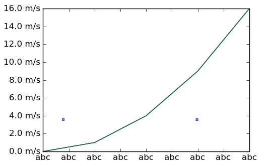
FuncFormatterを使うと値によって表示を変えたりできる。例えばホフメラー図の経度ラベルを以下のようにできた。

from matplotlib.ticker import FormatStrFormatter

ax.xaxis.set_major_formatter(xmajorFormatter)  #x軸主目盛
ax.yaxis.set_major_formatter(ymajorFormatter)  #y軸主目盛
ax.xaxis.set_minor_formatter(xminorFormatter)  #x軸補助目盛
ax.yaxis.set_minor_formatter(xminorFormatter)  #y軸補助目盛
Formatterには以下のようなものがある。いずれもmatplotlib.tickerのサブクラス。
| NullFormatter | 目盛りなし |
|---|---|
| FixedFormatter | 同じ文字列をふる |
| FuncFormatter | 引数を2つとる関数やlambda式を使って自分で設定 |
| FormatStrFormatter | フォーマットをコードで指定 |
| ScalarFormatter | |
| LogFormatter |
- 例
from matplotlib.ticker import *

ax.xaxis.set_majpr_formatter(FixedFormatter('abc'))                   #abcで固定
ax.yaxis.set_major_formatter(FormatStrFormatter('%.1f m/s'))    #小数点以下一ケタでm/sを単位
FuncFormatterを使うと値によって表示を変えたりできる。例えばホフメラー図の経度ラベルを以下のようにできた。
def lon2txt(lon, pos=None):
    fmt = '%g'
    lon = (lon+360) % 360
    if lon>180:
        lonlabstr = u'%s\N{DEGREE SIGN}W'%fmt
        lonlab = lonlabstr%abs(lon-360)
    elif lon<180 and lon != 0:
	lonlabstr = u'%s\N{DEGREE SIGN}E'%fmt
	lonlab = lonlabstr%lon
    else:
        lonlabstr = u'%s\N{DEGREE SIGN}'%fmt
	lonlab = lonlabstr%lon
    return lonlab

lon = np.arange(0.,360.,2.5)
time = np.arange(-10,11)

plt.contour(lon,time,olr)
plt.gca().xaxis.set_major_formatter(FuncFormatter(lon2txt))
plt.ylabel('Lag in Days')
plt.xlim([100,270])
plt.show()
ログスケールにする。
plt.xscale('log')
plt.yscale('log')
もしくはLocatorにLogLocatorを指定する。
ログスケールで目盛りの振り方を指定する。
オプションsubsを指定することでメモリをふる間隔を指定できる。
ax=plt.gca()
ax.set_yscale('log')
ax.yaxis.set_major_formatter(NullFormatter())
ax.yaxis.set_minor_formatter(FormatStrFormatter('%d'))
ax.yaxis.set_minor_locator(FixedLocator([1000,850,700,500,400,300,200,150,100,70,50]))

時系列軸の扱い
時系列ラベルはx軸のarrayとしてdatetimeクラスのリストを渡す。リストの作成にはdateutilモジュールが便利。

- 例
import datetime
from dateutil.relativedelta import *
time = [datetime.date(2010,7,1) + relativedelta(days=i) for i in range(62)]
matplotlibではその表示形式を操作する方法が提供されている。datesクラスのlocatorとformatterをaxisクラスのインスタンスに設定していく。
import matplotlib.dates as dates

ax=plt.subplot(111)
ax.xaxis.set_major_locator(dates.DayLocator(interval=10))     #主目盛を日単位で10日間隔で表示
ax.xaxis.set_minor_locator(dates.DayLocator(interval=5))   #補助目盛を日単位で5日間隔で表示
ax.xaxis.set_major_formatter(dates.DateFormatter('%d%b\n%Y')) #主目盛のラベルの表示形式を指定
- Locator
| AutoDateLocator |
|---|
- Formatter
Locator/Formatter
軸目盛りやカラーバー、コンターの間隔などにLocatorやFormatterと呼ばれるクラスのオブジェクトを指定できる場合がある。これらは指定したパラメータに応じて自動的に目盛りや間隔を調整する。
Locator
以下のようなものがある。
| NullLocator | |
|---|---|
| FixedLocator | |
| IndexLocator | |
| LinearLocator | |
| LogLocator | |
| MultipleLocator | |
| MaxNLocator | |
| AutoLocator | |
| AutoMinorLocator |
デフォルト値を設定する。
設定ファイルで指定する。
フォントサイズや線種などのデフォルト値は設定ファイルを書くことで変更できる。設定ファイルは$HOME/.matplotlib/matplotlibrcとする。サンプルファイルがあるのでそれをコピーして適当に変更する。
$ cp /usr/local/lib/python2.7/site-packages/matplotlib/mpl-data/matplotlibrc ~/.matplotlib/matplotlibrc
一時的にデフォルト値を変更する。
一時的に値を変更することもできる。繰り返し操作を行う際などで便利。スクリプトか対話モードが終了するかデフォルトファイルの再読み込みをするまで有効。
import matplotlib as mpl
mpl.rc('lines', linewidth=2, color='r')

font = {'family' : 'monospace',
        'weight' : 'bold',
        'size'   : 'larger'}

mpl.rc('font', **font)