必要なライブラリ 
ggplot2 と ggrepel が必要
install
install
install.packages("ggplot2")
install.packages("ggrepel")
load
library("ggplot2")
library("ggrepel")
サンプルデータ
乱数で以下のように生成した。
aggregate() で各回答の数を積算している。
a の各項目について n=0 のデータを追加しているのは data frame に項目がないと凡例に表示されないため。つまり、凡例表示用のダミーデータ。
a=c("A1","A2","A3","A4","A5","MA","NA");a=factor(a)
set.seed(0)
df = rbind(data.frame(a = a[runif(10, min = 1, max = length(a)) %>% as.integer()], n=rep(1, 10)), data.frame(a = a, n = rep(0, length(a))))
df
df = aggregate(df$n, by = list(a = df$a), FUN = sum); names(df)[2] = "n"
df
> a=c("A1","A2","A3","A4","A5","MA","NA");a=factor(a)
> set.seed(0)
> df = rbind(data.frame(a = a[runif(10, min = 1, max = length(a)) %>% as.integer()], n=rep(1, 10)), data.frame(a = a, n = rep(0, length(a))))
> df
    a n
1  MA 1
2  A2 1
3  A3 1
4  A4 1
5  MA 1
6  A2 1
7  MA 1
8  MA 1
9  A4 1
10 A4 1
11 A1 0
12 A2 0
13 A3 0
14 A4 0
15 A5 0
16 MA 0
17 NA 0
> df = aggregate(df$n, by = list(a = df$a), FUN = sum); names(df)[2] = "n"
> df
   a n
1 A1 0
2 A2 2
3 A3 1
4 A4 3
5 A5 0
6 MA 4
7 NA 0
runif() による一様乱数で A1〜A5、複数回答(MA)、無回答(NA) から 10 個適当に拾って、aggregate() で各回答の数を積算している。
a の各項目について n=0 のデータを追加しているのは data frame に項目がないと凡例に表示されないため。つまり、凡例表示用のダミーデータ。
下準備1: 積み上げ棒グラフの作成
ggplot() に df を与え、
aes() で に x に空文字列、y または weight に回答数 n、fill に回答種別 a を与える。
aes() に y を与えた場合は geom_col()、weight を与えた場合は geom_bar() を用いることによって、y または weight の値を単純に積み上げ(stack)、または100%換算した積み上げ(fill)した積み上げ棒グラフが得られる。
geom_col() または geom_bar() に与えるパラメータに position="stack" または position="fill" を与える事で stack と fill を切り替えることが出来る。
aes() で に x に空文字列、y または weight に回答数 n、fill に回答種別 a を与える。
aes() に y を与えた場合は geom_col()、weight を与えた場合は geom_bar() を用いることによって、y または weight の値を単純に積み上げ(stack)、または100%換算した積み上げ(fill)した積み上げ棒グラフが得られる。
geom_col() または geom_bar() に与えるパラメータに position="stack" または position="fill" を与える事で stack と fill を切り替えることが出来る。
| y | weight | |
|---|---|---|
| stack | geom_col() | geom_bar() |
| fill | geom_col(position="fill") | geom_bar(position="fill") |
ggplot(df) +
  aes(x="", y=n, fill=a) +
  geom_col()
ggplot(df) +
  aes(x="", y=n, fill=a) +
  geom_col(position="fill")
 | 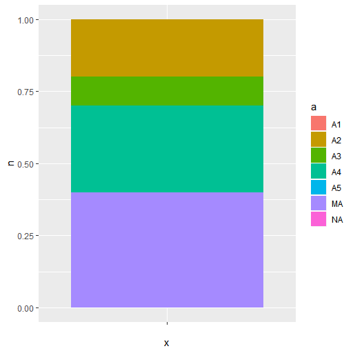 |
下準備2: ラベルの追加
geom_text() を使うとテキストが、geom_label() を使うとラベル(囲み付きテキスト)が追加出来る。
中央配置する場合、stack なら position=position_stack(vjust=0.5)、fill なら position=position_fill(vjust=0.5) を与えると手早い。
n=0 のデータは、凡例を全部表示させるためのダミーなので aes() に y=ifelse(0<n,n,NA) として与えて na.rm=T で除外する。
凡例に「a」とか邪魔表示が入るので、show.legend=F で落とす。
label は sprintf() で好みに加工すればよい。
なお、以下のような Waning が出るがこれは position_stack() に NA 無視させる方法が分からなかった。多分実害はないので無視しても問題ないだろう。
中央配置する場合、stack なら position=position_stack(vjust=0.5)、fill なら position=position_fill(vjust=0.5) を与えると手早い。
n=0 のデータは、凡例を全部表示させるためのダミーなので aes() に y=ifelse(0<n,n,NA) として与えて na.rm=T で除外する。
凡例に「a」とか邪魔表示が入るので、show.legend=F で落とす。
label は sprintf() で好みに加工すればよい。
ggplot(df) +
  aes(x="", y=n, fill=a) +
  geom_col() +
  geom_label(aes(y=ifelse(0<n,n,NA),label=ifelse(0<n,sprintf("%s:%2d\n%4.1f%%",a,n,100*n/sum(n)),"")),position=position_stack(vjust=0.5),na.rm=T,show.legend=F)
ggplot(df) +
  aes(x="", y=n, fill=a) +
  geom_col(position="fill") +
  geom_label(aes(y=ifelse(0<n,n,NA),label=ifelse(0<n,sprintf("%s:%2d\n%4.1f%%",a,n,100*n/sum(n)),"")),position=position_fill(vjust=0.5),na.rm=T,show.legend=F)
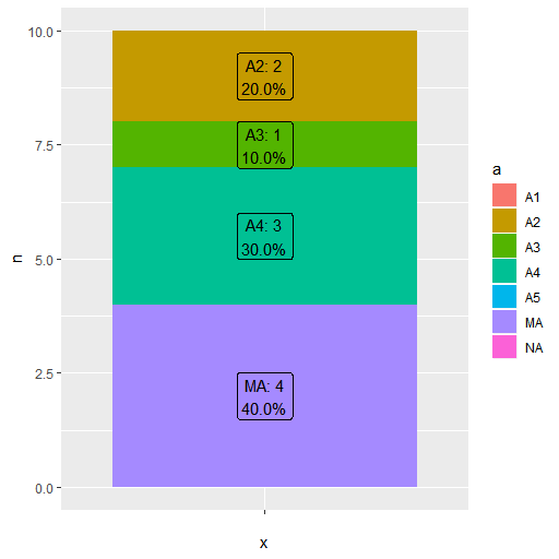 |  |
Warning message:
Removed 3 rows containing missing values (position_stack).
下準備3: ラベルの移動
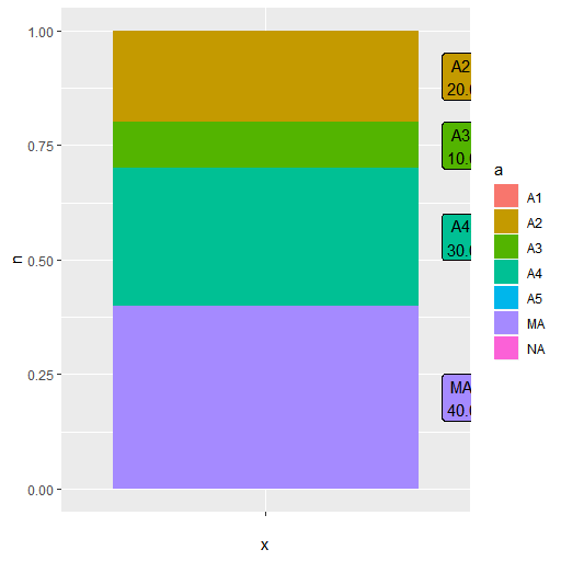
円グラフにした際、円グラフの外側にラベルが来るようラベルを右側に移動する。
これは、nudge_x を用いる必要があるが、nudge_x/nudge_y と position は排他なので、aes() に与える y を自分で調整する必要がある。
position_stack(vjust=0.5)、position_fill(vjust=0.5) 相当の出力を得るには
stack なら rev(cumsum(rev(n)))-n/2
fill なら (rev(cumsum(rev(n)))-n/2)/sum(n)
とすればよい。
これは、nudge_x を用いる必要があるが、nudge_x/nudge_y と position は排他なので、aes() に与える y を自分で調整する必要がある。
position_stack(vjust=0.5)、position_fill(vjust=0.5) 相当の出力を得るには
stack なら rev(cumsum(rev(n)))-n/2
fill なら (rev(cumsum(rev(n)))-n/2)/sum(n)
とすればよい。
ggplot(df) +
  aes(x="", y=n, fill=a) +
  geom_col() +
  geom_label(aes(y=ifelse(0<n,rev(cumsum(rev(n)))-n/2,NA),label=ifelse(0<n,sprintf("%s:%2d\n%4.1f%%",a,n,100*n/sum(n)),"")),nudge_x=0.6,na.rm=T,show.legend=F)
ggplot(df) +
  aes(x="", y=n, fill=a) +
  geom_col(position="fill") +
  geom_label(aes(y=ifelse(0<n,(rev(cumsum(rev(n)))-n/2)/sum(n),NA),label=ifelse(0<n,sprintf("%s:%2d\n%4.1f%%",a,n,100*n/sum(n)),"")),nudge_x=0.6,na.rm=T,show.legend=F)
 |  |
円グラフ化
あとは、これに coord_polar(theta="y") を与えれば良い。
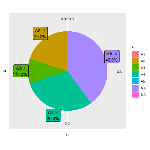
ggplot(df) +
  aes(x="", y=n, fill=a) +
  geom_col() +
  geom_label(aes(y=ifelse(0<n,rev(cumsum(rev(n)))-n/2,NA),label=ifelse(0<n,sprintf("%s:%2d\n%4.1f%%",a,n,100*n/sum(n)),"")),nudge_x=0.6,na.rm=T,show.legend=F) +
  coord_polar(theta="y")
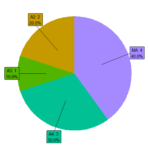
引き出し線の追加
テキストやラベルに引き出し線を追加するには geom_text()、geom_label() の代わりに、geom_text_repel()、geom_label_repel() を用いればよい。

ggplot(df) +
  aes(x="", y=n, fill=a) +
  geom_col() +
  geom_label_repel(aes(y=ifelse(0<n,rev(cumsum(rev(n)))-n/2,NA),label=ifelse(0<n,sprintf("%s:%2d\n%4.1f%%",a,n,100*n/sum(n)),"")),nudge_x=0.6,na.rm=T,show.legend=F) +
  coord_polar(theta="y")
背景や凡例の省略
座標軸や背景が邪魔な場合、theme_void() を追加することで、これらの要素を排除できる。ただし凡例が削除できない。
凡例も削除したい場合は、theme_void() の設定内容
凡例も削除したい場合は、theme_void() の設定内容
> theme_void
function (base_size = 11, base_family = "", base_line_size = base_size/22,
    base_rect_size = base_size/22)
{
    half_line <- base_size/2
    theme(line = element_blank(), rect = element_blank(), text = element_text(family = base_family,
        face = "plain", colour = "black", size = base_size,
        lineheight = 0.9, hjust = 0.5, vjust = 0.5, angle = 0,
        margin = margin(), debug = FALSE), axis.text = element_blank(),
        axis.title = element_blank(), axis.ticks.length = unit(0,
            "pt"), axis.ticks.length.x = NULL, axis.ticks.length.x.top = NULL,
        axis.ticks.length.x.bottom = NULL, axis.ticks.length.y = NULL,
        axis.ticks.length.y.left = NULL, axis.ticks.length.y.right = NULL,
        legend.box = NULL, legend.key.size = unit(1.2, "lines"),
        legend.position = "right", legend.text = element_text(size = rel(0.8)),
        legend.title = element_text(hjust = 0), strip.text = element_text(size = rel(0.8)),
        strip.switch.pad.grid = unit(half_line/2, "pt"),
        strip.switch.pad.wrap = unit(half_line/2, "pt"),
        panel.ontop = FALSE, panel.spacing = unit(half_line,
            "pt"), plot.margin = unit(c(0, 0, 0, 0), "lines"),
        plot.title = element_text(size = rel(1.2), hjust = 0,
            vjust = 1, margin = margin(t = half_line)), plot.subtitle = element_text(hjust = 0,
            vjust = 1, margin = margin(t = half_line)), plot.caption = element_text(size = rel(0.8),
            hjust = 1, vjust = 1, margin = margin(t = half_line)),
        plot.tag = element_text(size = rel(1.2), hjust = 0.5,
            vjust = 0.5), plot.tag.position = "topleft",
        complete = TRUE)
}
<bytecode: 0x000001e83ed68968>
<environment: namespace:ggplot2>
を参考にして
ggplot(df) +
  aes(x="", y=n, fill=a) +
  geom_col() +
  geom_label_repel(aes(y=ifelse(0<n,rev(cumsum(rev(n)))-n/2,NA),label=ifelse(0<n,sprintf("%s:%2d\n%4.1f%%",a,n,100*n/sum(n)),"")),nudge_x=0.6,na.rm=T,show.legend=F) +
  coord_polar(theta="y") +
  theme(legend.position="none",panel.background=NULL,axis.title=element_blank(),axis.text=element_blank(),rect=element_blank(),line=element_blank())
くらいしておけば、おおよそいらない物は消えると思う。
視認性の改善
グラフの枠線は geom_col()、geom_bar() の colour で色指定できる。
凡例は、scale_fill_manual() の values で色指定出来る。
カラーテーブル
枠線とカラーテーブルの適用。

凡例は、scale_fill_manual() の values で色指定出来る。
カラーテーブル
mycolor = rev(c(
    "#ffa0a0",
    "#ffe0a0",
    "#ffffe0",
    "#c0ffc0",
    "#a0ffff",
    "#a0e0ff",
    "#a0c0ff",
    "#c0c0ff",
    "#e0c0ff",
    "#ffc0ff",
    "#e0e0e0"))
枠線とカラーテーブルの適用。
ggplot(df) +
    aes(x="", y=n, fill=a) +
    geom_col(colour="black") +
    geom_label_repel(aes(y=ifelse(0<n,rev(cumsum(rev(n)))-n/2,NA),label=ifelse(0<n,sprintf("%s:%2d\n%4.1f%%",a,n,100*n/sum(n)),"")),nudge_x=0.6,na.rm=T,show.legend=F) +
    coord_polar(theta="y") +
    scale_fill_manual(values=rev(mycolor)) +
    theme(legend.position="none",panel.background=NULL,axis.title=element_blank(),axis.text=element_blank(),rect=element_blank(),line=element_blank())
配置方向
デフォルトだと theta="y" で y 軸の正方向が数学的な座標軸で第1象限から 2, 3, 4 象限へと反時計回りに進行する。
y 軸の正方向を時計回りに進行させるには、coord_polar() に direction=-1 を与える。

y 軸の正方向を時計回りに進行させるには、coord_polar() に direction=-1 を与える。
ggplot(df) +
    aes(x="", y=n, fill=a) +
    geom_col(colour="black") +
    geom_label_repel(aes(y=ifelse(0<n,rev(cumsum(rev(n)))-n/2,NA),label=ifelse(0<n,sprintf("%s:%2d\n%4.1f%%",a,n,100*n/sum(n)),"")),nudge_x=0.6,na.rm=T,show.legend=F) +
    coord_polar(theta="y",direction=-1) +
    scale_fill_manual(values=rev(mycolor)) +
    theme(legend.position="none",panel.background=NULL,axis.title=element_blank(),axis.text=element_blank(),rect=element_blank(),line=element_blank())
参考
- stackoverflow / 2018-09-10: Unexpected behaviour in ggplot2 pie chart labeling